How to Add a Copyright Section to a WordPress Website
Including a copyright notification in the footer section of a website is considered best practice in web design. It establishes the year the website was first published and the owner of the copyright for the website. While this footer section can be included on all of the webpages for your website, it is most important to include it on the homepage.
A copyright notification lets users of your website know that you claim copyright of your website and that use of its contents without your permission would violate your copyright. Technically, a copyright notification is not required by law to protect your copyright for your website; but it is a relatively quick and simple process to stake your claim on your website and make it clear to your users that you claim ownership of the content of your website and, if necessary, will protect your rights to that content.
To be clear, a copyright notification is not a substitution for copyright registration. To be fully protected from copyright infringement, you will need to register your copyright with the appropriate government body/bodies, for example in the U.S. copyright is overseen by the U.S. Copyright Office. Even if you choose not to go through the process of registering your copyright for your website, it is still a good first step to include a copyright notification in the footer of the homepage of your website.
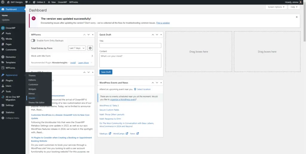
Step 1: Dashboard > Appearance > Header

Open your website’s administrative dashboard. There are a couple of ways to access this. I usually navigate to this page through my web hosting service.
This page can also be accessed by going to your website’s url followed by “/wp-admin”. (For example, example.com/wp-admin) Once you are signed in this will direct you to the dashboard.
From the dashboard, hover over the Appearance option on the sidebar, then select the Header option.
Step 2: Footer Bottom

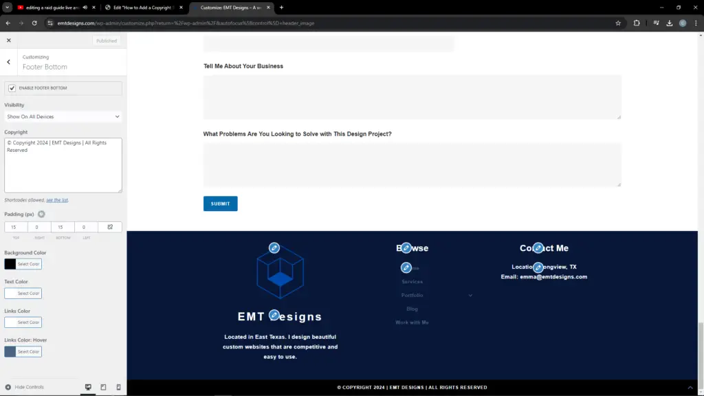
From the Header section, select the Footer Bottom option from the sidebar.
Step 3: Enable Footer Bottom

Make sure Enable Footer Bottom option at the top of the sidebar is selected.
Step 4: Copyright

A copyright notification needs to include the copyright symbol or the word copyright, the year the website was created, and the name of the company or person who owns the copyright. I also include the phrase “all rights reserved” in my copyright notification. To break up the information and make it easier to tell that the inclusion of my company’s name is to identify the copyright holder, I include line breaks (for example, “|”).
Step 5: Options

The padding settings are a personal preference. I think that 15 pixels on the top and bottom allows for some breathing room without making the section too large.
While you can set the background color of this section to any color, I recommend sticking to black (or, if your website is designed with a dark mode option white, off-white, or grey). This will help to highlight the section and contrast it from your footer section’s navigation and contact information. Another good option is to match the color for the copyright notification section to the background color for your larger footer section, as long as your footer section’s background color is a strong contrasting color from the rest of your homepage.
Your text color selection should stand out from the background and be easy to read. For example, I chose white text on a black background.
The links color selection can contrast from regular text to bring attention to any links. There are no links in my copyright notification section. If you wanted to include a page on your website with further information about your copyright policy, I would recommend choosing a links color that is different from your text color. For example, in my larger footer section, the browse section includes links to important pages on my website. These links are in a complementary color to my text color to make it easy to tell that they are links.
A links color: hover color selection is optional, but it is a useful signal to your website’s users that a section of text is a clickable link. This color should be a complementary color to your links color selection. I recommend using a version of your links color selection that is a shade or two lighter or darker. This will be visually noticeable without being overwhelming.


