5 Best Canva Typefaces for Law Firm Logos
You’re designing a logo for a law firm in Canva. It needs to be simple, elegant, and professional. Most importantly it needs to be done yesterday. You have clients to help! There are hundreds of templates and just as many typefaces to choose from. What was supposed to be a quick and easy task has become quite a chore. I’m here to help.
What follows is a list of my 5 favorite typefaces to use when designing logos for law firms in Canva. They each have their own vibe, but all of them are appropriate for an expert team of lawyers looking to put their best foot forward and define their brand.
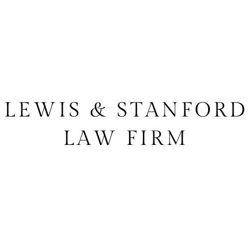
Gilda Display

Gilda Display feels classic to me. This typeface is elegant and streamlined. It is simple without being boring – professional but not uptight.
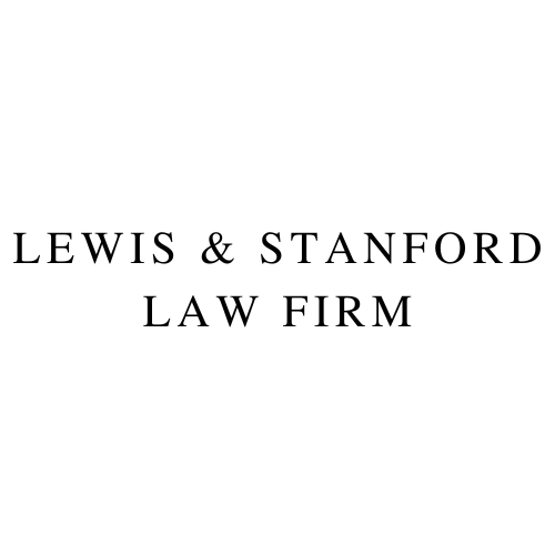
Tex Gyre Termes

Tex Gyre Termes is bold. It’s classic and sturdy. This typeface is firm, even rigid. It reminds me a bit of the Law & Order logo.
Rosario

Rosario is more modern than the previous typefaces, but still very simple and elegant. It is the only sans serif font in this list. Sans serif fonts can read too trendy for some of the more traditional law firms; but I think it’s a perfect fit for a group of lawyers trying to stand out from the crowd.
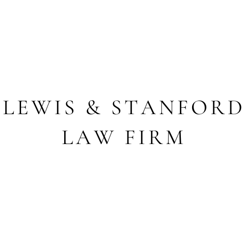
Cormorant Garamond

Cormorant Garamond is one of my favorite typefaces for logos. It’s a clean, tasteful font. I particularly enjoy the stylish extended “w” with the very traditional ampersand.
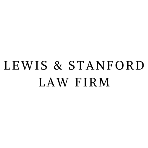
Alike

Alike is the typeface I would choose for a client who wants to use Times New Roman for everything. It’s classic. It doesn’t have a lot of flourishes, but it isn’t entirely lacking in personality. Alike is a nice, straight forward choice for a law firm logo’s typeface.


